Brought to you by The Block Shop
This week's reveal is bittersweet...it's the last of the interior room reveals, which means The Block Fans v Faves is almost at an end! (insert pouty sad face)
The master bedroom and ensuite is my favourite reveal. Whenever I go to an open house, or display home, I always save the master suite until last. Why? It's the space that I would call my own...a haven if you will. It's where you imagine spending time with your partner, enjoying leisurely weekend sleep ins, spending Sunday snuggle time with the kids, and escaping from the pressures of the world.
Let's see how the Fans and Faves tackled their master bedrooms and ensuites this week...
Chantelle and Steve
The style starts right from the very moment you walk down the hallway to Chantelle and Steve's master suite. Chantelle and Steve lined their bright and airy walls with colour movie poster prints in simple black frames, giving this space a gallery feel.
A black feature wall inserted with a black padded bedhead gives this room real impact. The black doesn't seem overpowering at all given how much light this room receives. The pops of colour in artwork and cushions are perfect, allowing this room to remain uncluttered and quite neutral. In lieu of bedside tables, Chantelle and Steve have cut away the wall surrounding the bed...a simple and effective surface storage solution. A simple white pendant and sheer curtains finish off this space beautifully.
A dressing table and bench seat flank the wall, giving the new owner more usable spaces in this master bedroom...a comfortable place to tie your shoes, read a book, or just while away the day.
Onto the ensuite...one word...wow! Chantelle and Steve delivered a gorgeous bathing space for this master suite. Their choice of vanity and basin is outstanding...surprising even the judges who'd never seen the Alape Chrystalline basin before. It's definitely a talking point.Chantelle and Steve's tiles choices were equally as impressive. Crown grey oak tiles cover the walls and floor, while Castle Pyramid tiles were used on the feature wall. Judge Neale Whitaker commented that they were the best tiles he'd seen this season! Personally, I love that they have a brown undertone, allowing for a warmer grey colour scheme.
Like Chantelle and Steve, Kyal and Kara painted their hallway in a warm white, and adorned the walls with a beautiful series of Ellin Malin prints creating a gallery feel. That's where the similarities end. I really felt for Kyal and Kara last night. The judges were particularly harsh in respect of the master bedroom they created.
Kyal and Kara installed cement sheeting and black wall lights, reinforcing the industrial feel in their apartment. The judges commented that the cement sheeting was too harsh for a master bedroom, and that a bedhead was needed. It appears since judging they've their advice, installing a warm grey upholstered bedhead against the wall. It certainly softens the space up considerably. The judges were also underwhelmed by their choice of bedside table. Personally I like the little stools, however I do agree that something more substantial would have suited the space better. The pink, purple, and grey bedding is a really nice touch.
The judges also criticised their choice of chair. Shaynna Blaze commented that it would be better suited to a dentist's office. I disagree. I firmly believe that for a master bedroom to be successful, there needs to be a balance of the feminine and masculine. This is a shared space, and it can't be all feminine softness...your partner needs to feel at home as well.
Lastly, the judges commented that there shouldn't be a television in the bedroom. Where are these people living? We watch our bedroom television nearly every single night, and the news is on every single morning. If I were creating a new master bedroom, a television would be on the list of needs. What do you think?
The judges were full of praise for Kyal and Kara's ensuite, and with good reason. This space is gorgeous! The oversized basin with double black tapware gives this couple plenty of room to share this bathroom, and there's plenty of storage below for bath linens, eliminating the need for a linen cupboard.
Nu Carrara marble lines the walls of this space, with a Carrara marble penny rounds used for a feature wall. Love! This is the first room Kyal and Kara have steered clear of their signature Blackbutt timber look, and I'm glad. This bathroom is elegant and well resolved.This week, Alisa and Lysandra delivered another major wow-factor in their apartment...a void that opens the space between the kitchen/dining area and the upstairs bedrooms. This small 3x2m opening floods the floor below with loads of natural light...a major bonus considering the lack of windows below.
By installing a void, Alisa and Lysandra's master bedroom is smaller than the other apartments, but that doesn't mean they've skimped on style! I love how consistent Alisa and Lysandra's apartment is. The black wardrobe doors reference the storage in the dining room, while the teal brings in the colours used in the second bedroom.
As I mentioned above, masculine touches are essential in a master bedroom. The mix of straight-lined timber chair (the masculine), is perfectly balanced by the knitted pouf and sheer curtains (the feminine).
Like Kyal and Kara, Alisa and Lysandra have installed cement sheeting as a feature wall behind the bed, and like the judging of Kyal and Kara's room, the judges suggested that a headboard is necessary to soften the space. The judges felt the room had that raw industrial feel, but was better resolved than Kyal and Kara's master bedroom. I agree. There's nothing worse than losing your pillow down the back of the bed, or accidentally hitting your head on the wall. That aside, this room is beautiful, with it's soft colours and warm wood tones.
Alisa and Lysandra's ensuite is smaller than those of the other apartments, however what they've managed to install in this space is amazing! A shower built for two with wall jets are completely indulgent. If there were somewhere to sit in there, I'd never get out!
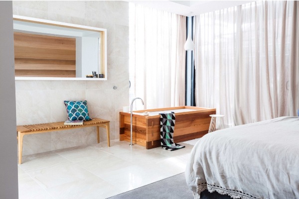
This week's winners!! This is my favourite space of the week. Brad and Dale thought completely outside of the box and installed a full-sized bath in the actual master bedroom. While some might think this is an odd design decision, just imagine how romantic this space could be. Light a few candles, pop the bubbly, and take a soak while looking at the sky. Beautiful.
The sleeping side of the master bedroom is plush, with soft carpets, sheer linen curtains, and relaxed bed linens. The timber wall feature is beautifully replicated in the bath surround and bench seat.
A large walk in wardrobe with hidden storage behind the mirror will satisfy any couple occupying this space, while the floor tiles extend from the bath area right through to the ensuite. This makes the ensuite feel twice as large!
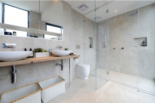
This ensuite looks so spacious. An oversized shower flanks one wall, and encompasses part of the window wall...thankfully privacy isn't an issue here. A stylish toilet is hidden behind a double vanity. Shaynna commented that the mirror was too high. I agree...us 5'3" women would have to stand on tippy toes to see ourselves. I love the vanity shelf, however I'm not a fan of the baskets underneath. Overall, this is most definitely the best space of the week. Well done boys!
Which master bedroom and ensuite is your favourite?


