 Here's my take. I liked the placement of the photos in the ad, as well as the little house (and lucky me...I had a Pink Paislee house in my stash!). I also used the strips of black, top and bottom, as well as the placement of the text. I think my layout looks similar in style to the ad.
Wednesday, June 24, 2009
more to share...
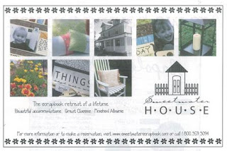
More from the Simply Obsessed Got Talent challenges...for this one we had to pick out an ad and create a layout inspired by it. I found this ad in an old issue of Simple Scrapbooks and I loved the graphic, grid style.
 Here's my take. I liked the placement of the photos in the ad, as well as the little house (and lucky me...I had a Pink Paislee house in my stash!). I also used the strips of black, top and bottom, as well as the placement of the text. I think my layout looks similar in style to the ad.
 Here's my take. I liked the placement of the photos in the ad, as well as the little house (and lucky me...I had a Pink Paislee house in my stash!). I also used the strips of black, top and bottom, as well as the placement of the text. I think my layout looks similar in style to the ad.
Subscribe to:
Post Comments (Atom)


4 comments:
Love your interpretation and use of PP! That particular sheet isn't my favorite so it's so nice to see it in use by you, thanks for the idea!!!!
just checked out your last 3 posts. I'm so impressed at all the LOs you achieved in a short space of time. Lynne D
You've done a great job with this, must check out the ad-inspired challenges more often.
these are lovely Lisa...gorgeous!
Post a Comment